Graph Showing SSC Results of a School
This is a graph showing the SSC results of a school. Describing the graph of the SSC results of a school is important for the SSC and HSC examinations. So, the SSC and HSC examinees should emphasize the learning graph description of the SSC results of a school.
Instead of the SSC result, it could be the HSC result, and instead of a school, it could be the result of a college. A sample description of the graph is given below. If the students practice and know how to describe this type of graph, they will be able to jot down the description of a graph on different data.
Lots of good wishes to the students.
Graph description of the SSC results of a school
The graph below shows the SSC results of Uttara High School from 2008 to 2012. The larger columns in the graph show the pass rate, and the smaller columns show the percentage of the students who got an A+. Now, describe the graph in your own words.

The graph shows the SSC results of Uttara High School from the year 2008 to 2012.
In the year 2008, 80% of students passed from the school with different grades. And 5% of students got an A+ in that year.
In 2009, 85% of students passed, achieving different grades, while 5% of students got an A+ like the previous year. This year, the pass rate was 5% more than the previous year (2008), though the percentage of getting an A+ was the same as in 2008.
In 2010, the pass percentage reached 90% by increasing 5% from 2009. The percentage of A+ also became 10%. Both the pass percentage and percentage of A+ rose 5% in the year 2010 compared to the previous year 2009.
In 2011, the pass rate increased consecutively like the previous years, and it was 95%, while the rate of getting an A+ decreased from the previous year. By dropping 5% A+, the percentage of getting A+ reached 5% again, like the year 2009.
The pass rate was 95% in the year 2012, like the year 2011, but the rate of getting an A+ increased more than the previous year, and it was 10% by increasing 5%.
So, from the given graph, we can see the pass rate and the rate of getting an A+ at Uttara High School from 2008 to 2012. The pass percentage increased continuously from 2008 to 2012. However, the percentage of A+ fluctuated in different years.
Graph Showing SSC Results of a School
The graph below depicts the SSC results of Milestone School, Dhaka, from 2014 to 2018. In the graph, there are two columns for every single year. The bigger column shows only the pass percentage, and the smaller column shows the percentage of students who got an A+. Now, describe the given graph using simple language.
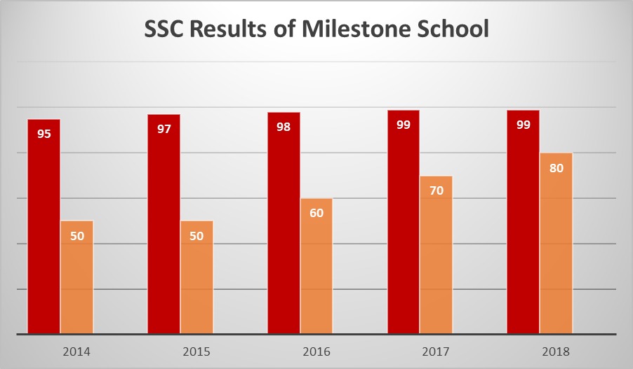
The Graph of the SSC Results of Milestone School.
The given graph shows the SSC results of Milestone School, Dhaka, from 2014 to 2018. Below are the numbers for the pass rate and A+ achievement rate.
2014: Pass 95% and A+ 50%
2015: Pass 97% and A+ 50%
2016: Pass 98% and A+ 60%
2017: Pass 99% and A+ 70%
2018: Pass 99% and A+ 80%
The graph given in the question paper shows the SSC results of Milestone School, Dhaka, from 2014 to 2018. From the graph, we can see that the pass rate of Milestone School’s SSC examinees was quite high in all five years.
In the graph, there are two columns for every single year. The bigger column represents the pass percentage, and the smaller column shows the percentage of students who achieved an A+.
According to the data in the graph, in 2014, the pass rate was 95%, and 50% of the students got an A+.
In 2015, the pass percentage increased slightly to 97%, while the A+ rate remained the same at 50%.
In 2016, both the pass rate and A+ rate increased. The pass rate rose to 98%, and the percentage of A+ students also increased to 60%.
The results improved a little bit further in 2017. This year, the pass rate reached 99%, and 70% of the students obtained an A+.
In 2018, the pass percentage remained at 99%, as in 2017. However, the A+ rate increased significantly to 80%. The pass percentage and the rate of getting an A+ were the highest in the year 2018 among all five years, based on the information in the graph.
Overall, the graph shows a steady and balanced improvement in both pass percentage and A+ results over the specific years. The academic performance of students of Milestone School proved that all the teachers and students worked hard and performed their duties properly. The SSC results also indicate that the academic performance of the students of Milestone School, Dhaka, improved gradually from 2014 to 2018.


0 Comments